
Data visualization is the process of creating visual representations of data in order to better understand, analyze, and communicate the information contained in the data. Data visualization can be used to represent data in many different forms, such as charts, graphs, maps, and plots.
Data visualization is an important tool for data analysis, as it allows people to quickly and easily understand complex data sets and identify trends and patterns. It can also be used to communicate data-driven insights and findings to others, such as colleagues, stakeholders, and the general public.
There are many different tools and software packages that can be used for data visualization, including Excel, R, Python, and Tableau. These tools allow users to create a wide range of visualizations, including bar charts, line graphs, scatter plots, and map visualizations.
There are many different types of data visualization, each with its own strengths and uses. Here are a few examples:
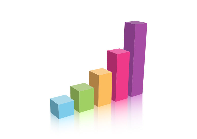
A bar chart is a graphical representation of data that uses bars of different heights to show the relative sizes of different categories. Bar charts can be used to compare data across categories or to show trends over time.
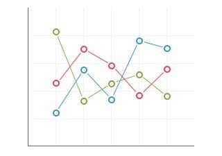
A line graph is a graphical representation of data that uses lines to connect data points. Line graphs are often used to show trends over time or to show the relationship between two variables.
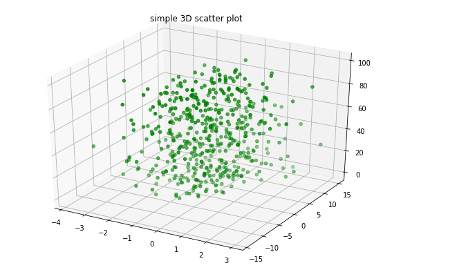
A scatter plot is a graphical representation of data that uses dots to represent individual data points. Scatter plots are often used to visualize the relationship between two variables.

A pie chart is a graphical representation of data that shows the proportions of different categories as slices of a pie. Pie charts are often used to show the relative sizes of different categories.

Map visualizations are graphical representations of data that are displayed on a map. They are often used to show spatial patterns or trends in data.
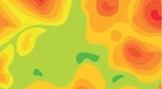
A heat map is a graphical representation of data that uses color to encode values. Heat maps are often used to visualize patterns or trends in data, particularly when the data is dense or has multiple dimensions.